UX/UI Design
- UI/UX Design
- Web Design
- Research
Project overview
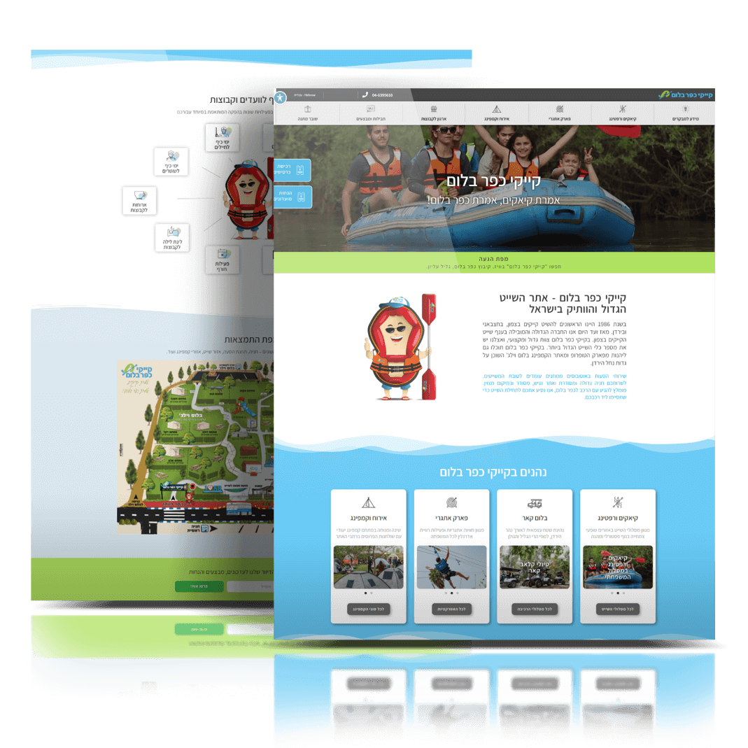
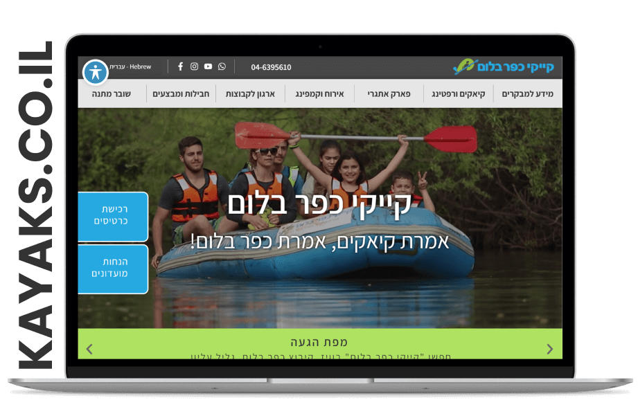
Kfar Blum Kayaks struggled with inconsistent web experience, insufficient product information, subpar mobile navigation, confusing product categories, among others. They recognized the imperative need to implement user experience improvements to stay attuned to market requirements and facilitate organic business growth.
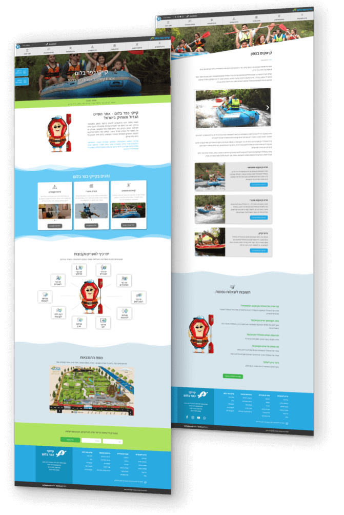
As a UX consultant for Kayaks.co.il, I conducted a user research, which involved usability studies, benchmarking, and creating personas. Based on this research, a new user flow, wireframes, and prototypes, were developed, and implemented a user-centred visual design. Furthermore, I ensured consistency by thoroughly reviewing the entire website.
Process
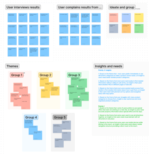
As a UX consultant for Kayaks.co.il, I conducted a user research, which was divided into a few phases:
- Conducting User interviews
- Analytics data(Google Analytics)
- Collecting data from existing users of web site, through Kayak’s call centre that did reservations, and e-mails.
- Competitive analysis
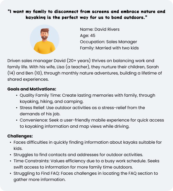
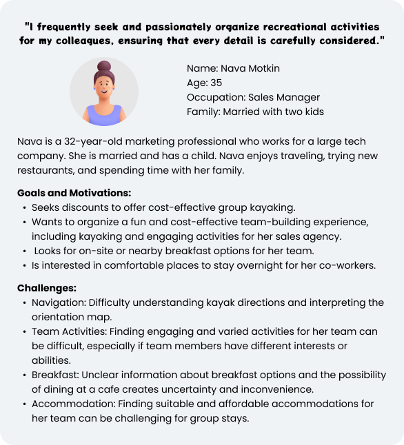
- Personas
- Pain points
- Main goals
After conducting User Interviews, I gained and synthesize information to better understand who the users are. This helped me to uncover common patterns that led to key insights which would help me identify what our users’ needs truly are.
Personas
Main User flow

Main Changes
Before
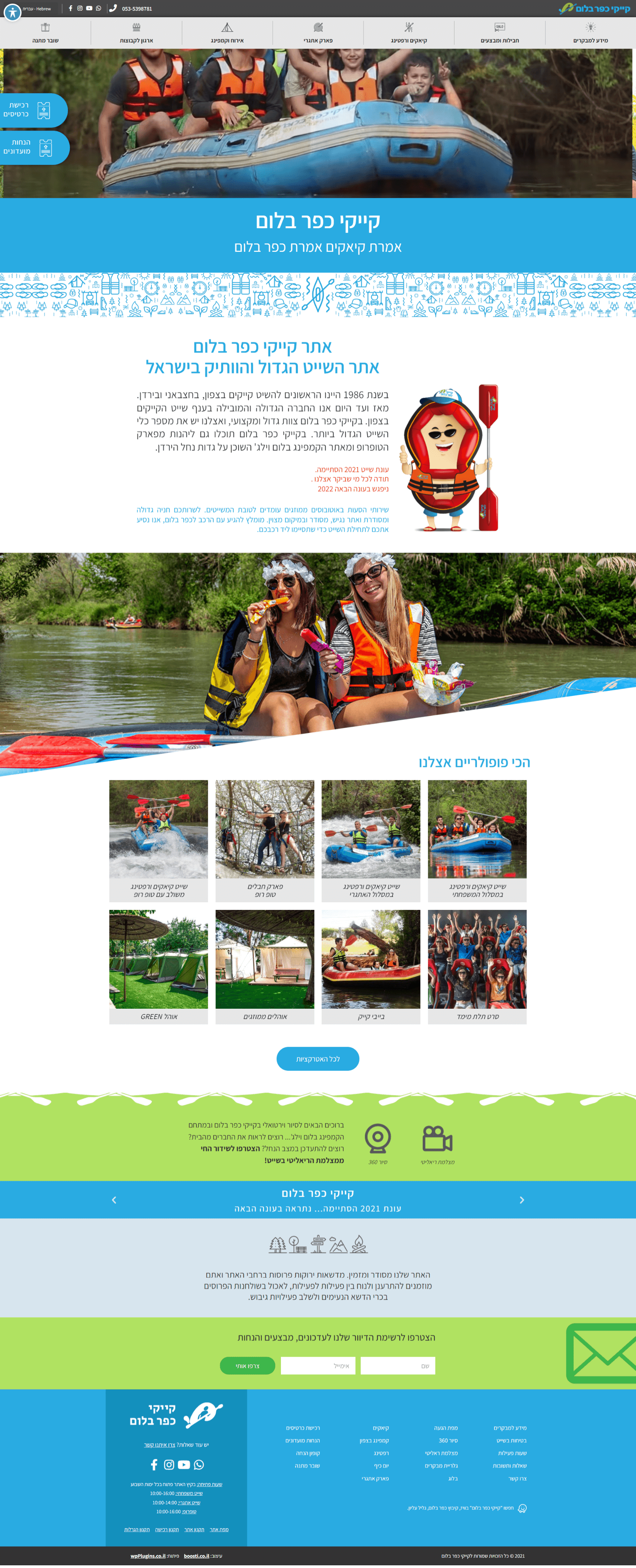
Insufficient product
information
Too big "about us"
section that most
users won’t read
The Image that does
not promote the
business goals
Not working
features
Overload of
unordered
categories
Un-engaging
information
Inconsistencies Design -
border-radius,
box-shadows, etc.
After

Short and engaging
product information
Organized by categories
and display only featured
products for a clear and
user-friendly process
Wave shaped dividers
for sleek and intuitive
user experience
Promote the variety
of product types
from the homepage
Park map for a seamless
journey through users
adventure. Discover key
locations, navigate
effortlessly, and make
every moment memorable.
Improved mobile navigation flow
According to the resort data, travelers vacationing the Israeli north, visit the kayaks website using mobile devices while driving to the resort.
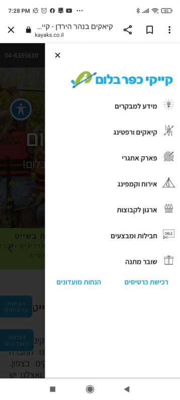
To improve the navigation for users using mobile devices, we have restructured the mobile navigation screen that appears when clicking the “hamburger” button.
The list of links have been replaced with a visually appealing interface emphasising the main product groups and reducing the visibility of the less important links.
To improve accessibility and simplify the mobile navigation, icons were added to each product group.
In order to further increase conversion rate from mobile users, a big “Purchase Tickets” CTA was added.
For clients using the menu while driving to the resort, two quick links were added to call to the resort call-center or to open the Waze application (providing a direct route to the resort).
Before
After
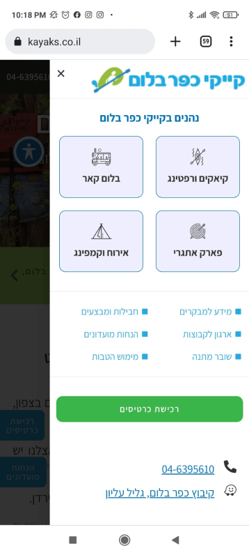
The new design, backed by Google Analytics data, delivered! The website saw a significant jump in mobile hamburger menu clicks, suggesting improved user experience.
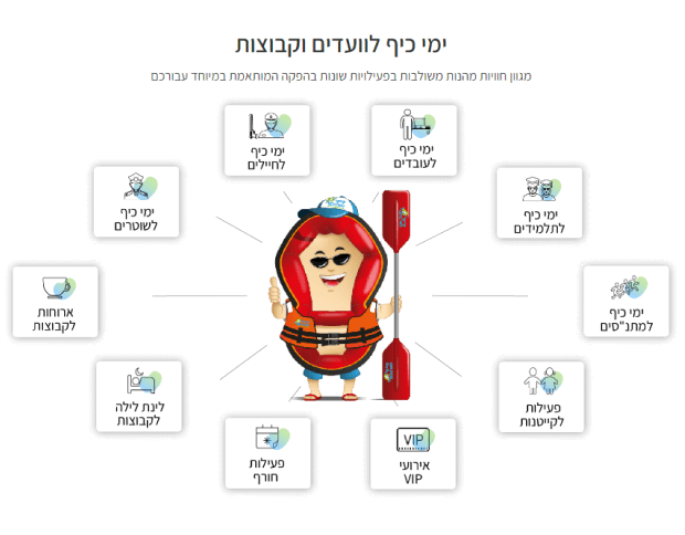
To increase sales, the most popular services for groups added to the homepage and promoted from prime location.
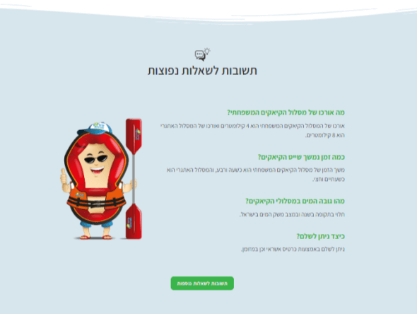
Researching the website showed that the website had a single FAQ page containing a lot of information for different products. However, according to “Google Analytics” this page received low traffic.
To reduce user confusion, the data distribution was changed, moving some FAQs to the main product groups (kayaks & rafting, camping, blum cars, and the fun park). This way each product group had its own FAQ section containing only the relevant information for its products. It also improved the SEO as multiple pages received FAQ elements with structured data schema.
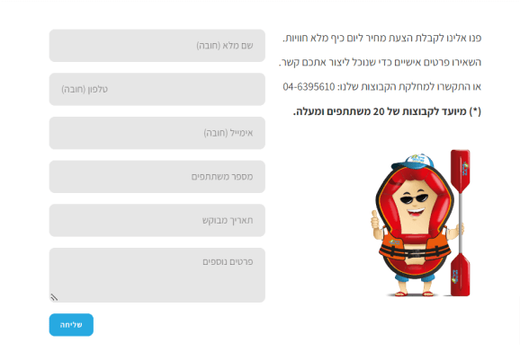
The old website had many design visual inconsistencies. All the elements across the entire website including form fields, CTA buttons, popups etc, they were all mapped and updated to use the same design system.
