UI/UX & Branding
- Web Design
- UI/UX Design
- Brand & Identity
- Logo Design
Project overview
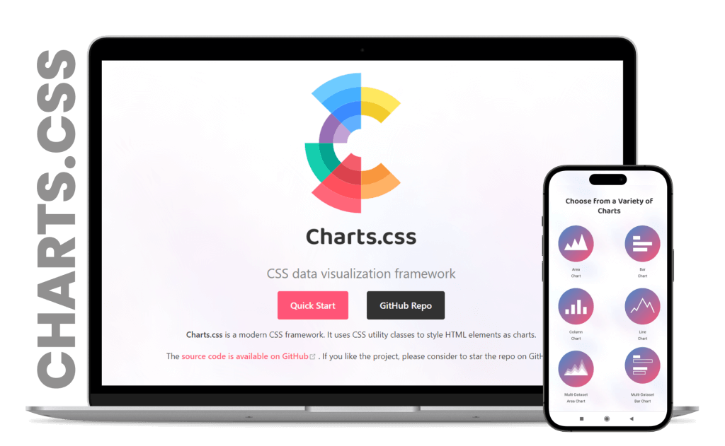
ChartsCSS.org is a CSS data visualization framework designed to enhance developer efficiency, reduce page loading time and improve website performance. The site provides detailed documentation on using the framework to create charts and graphs, including code examples, and visual results.
Project duration – 3 weeks
| 2016 | |
|---|---|
| 2017 | |
| 2018 | |
| 2019 | |
| 2020 |
Design process
- Empathize
- Define
- Ideate
- Design
- Testing
- Research
- Design Goals
- Sketching
- Logo Design
- Visual/UI design
- Users interviews
- Problem Statement
- Information Architecture
- Wireframes
Research
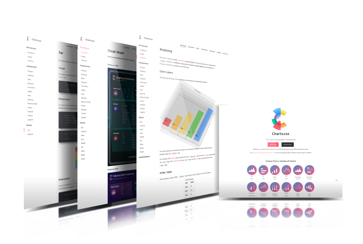
Before diving into the design processes, a research plan was created to run in-depth research with user interviews and competitive analysis that helped make data-driven decisions for data visualization framework and deliver an improved user flow, structure, brand identity and user interface design.
Goal
The goal is to create a user-centered and informative website that empowers frontend developers to effectively utilize Charts.CSS for their data visualization needs. As well as to create a unique homepage interface and Brand Identity that would be easily recognizable by users and attract potential customers.
Chalenges
User Learning Curve
Ensuring that users can quickly understand how to interpret and interact with different data visualizations is a challenge. Designing intuitive visual cues and providing clear guidance can help users navigate the learning curve.
New User Education
Lack sufficient value for first-time users.Users should be able to quickly understand why the framework is valuable and how it can solve their data visualization needs.
Clarity and Complexity
Balancing the need to showcase the framework’s capabilities with the importance of maintaining a clear and straightforward user experience is challenging.
Solution
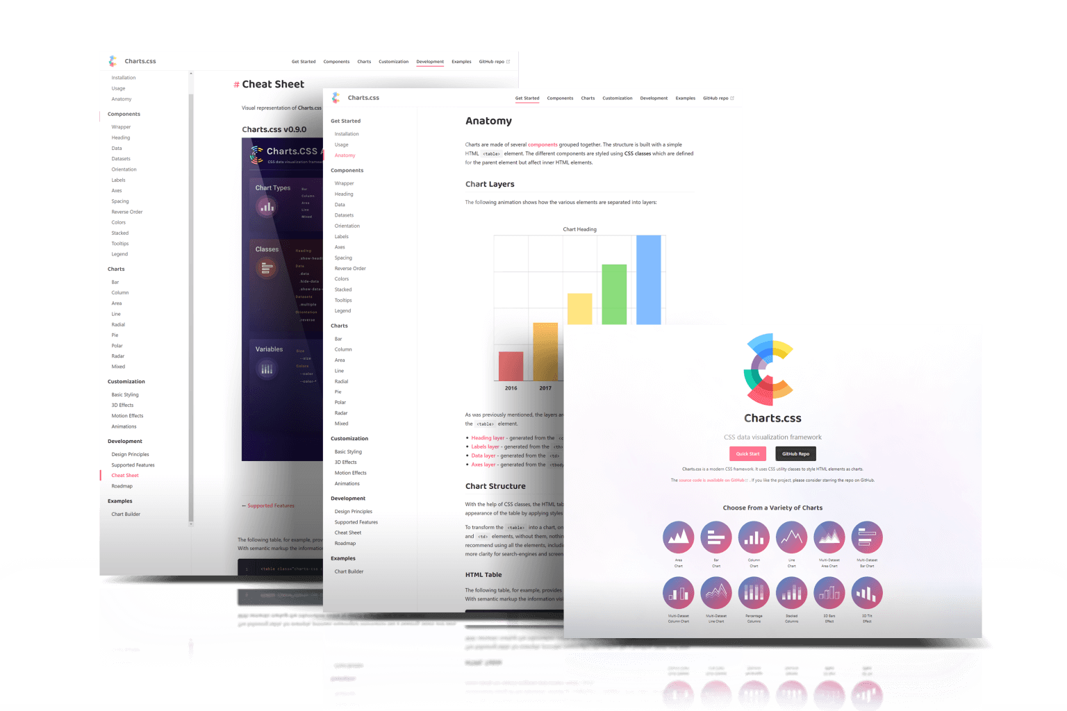
The homepage layout was changed to provide more value for first time users.
The homepage content was updated, instead of focusing on the fact that it’s an open-source framework, the focus was on what the framework does and its capabilities.
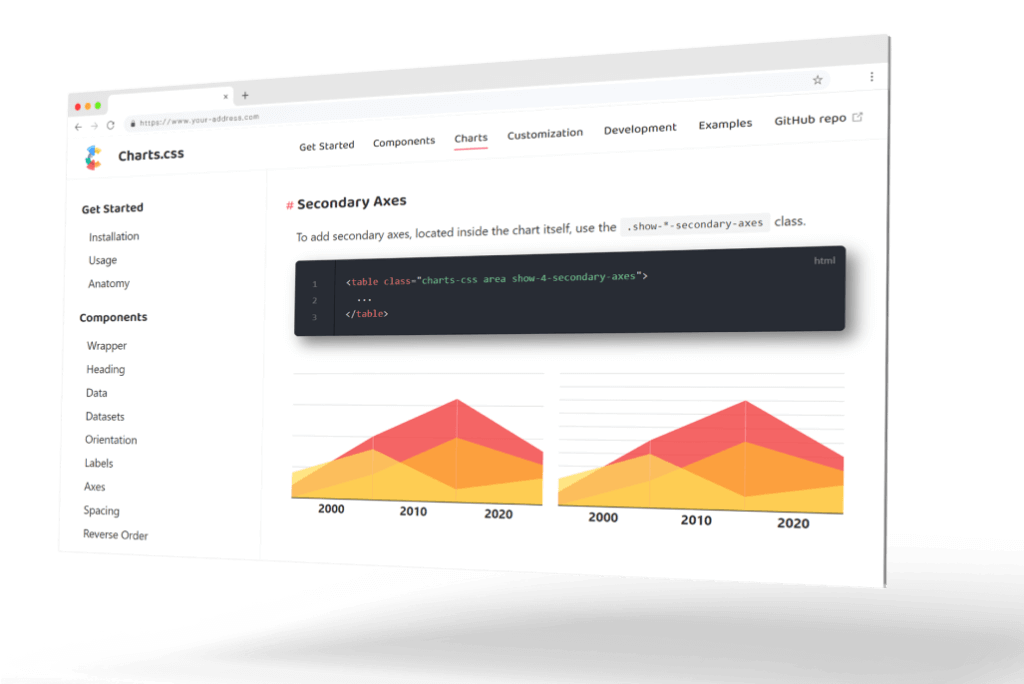
A set of 12 icons added to the homepage displaying the variety of charts can be created with the framework.
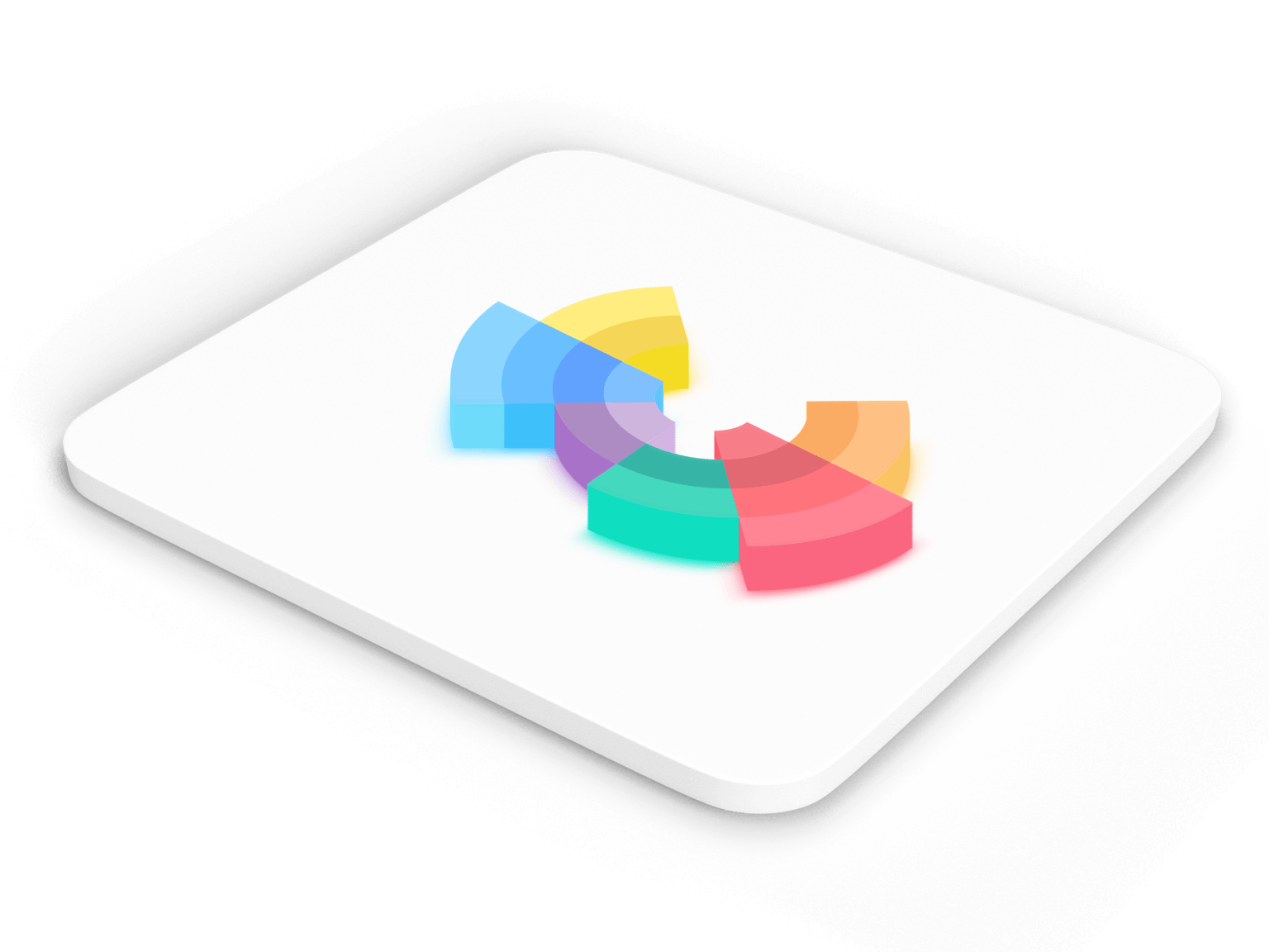
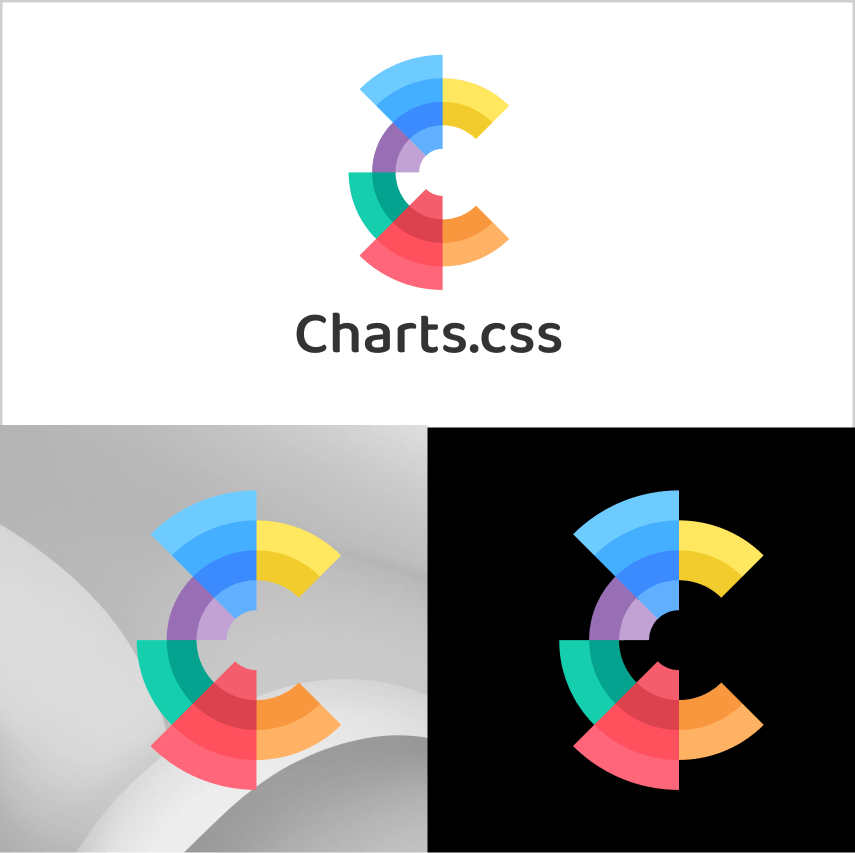
The logo was designed to be memorable and distinct, catering to user recognition.
Information architecture
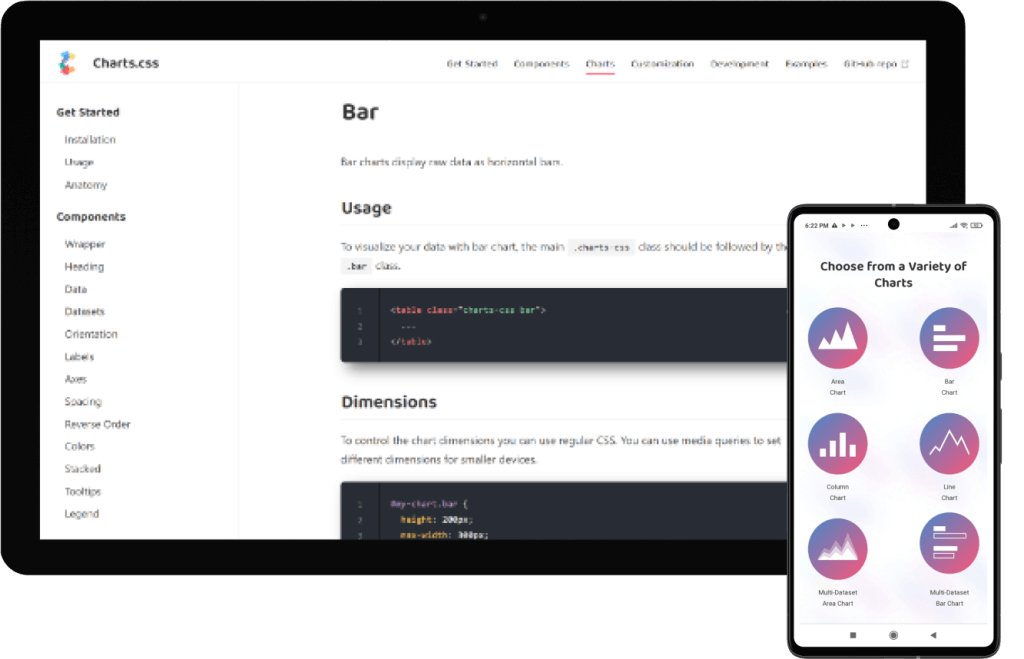
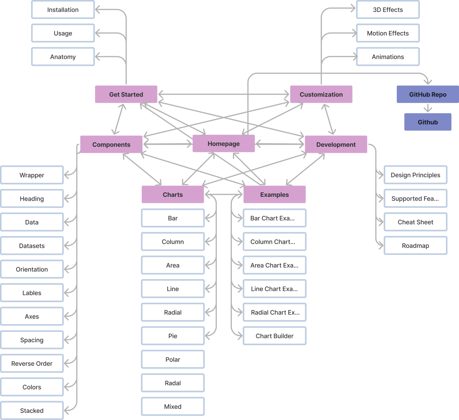
In created matrix model of information architecture users can navigate to any page of this model, so they can explore a website freely.
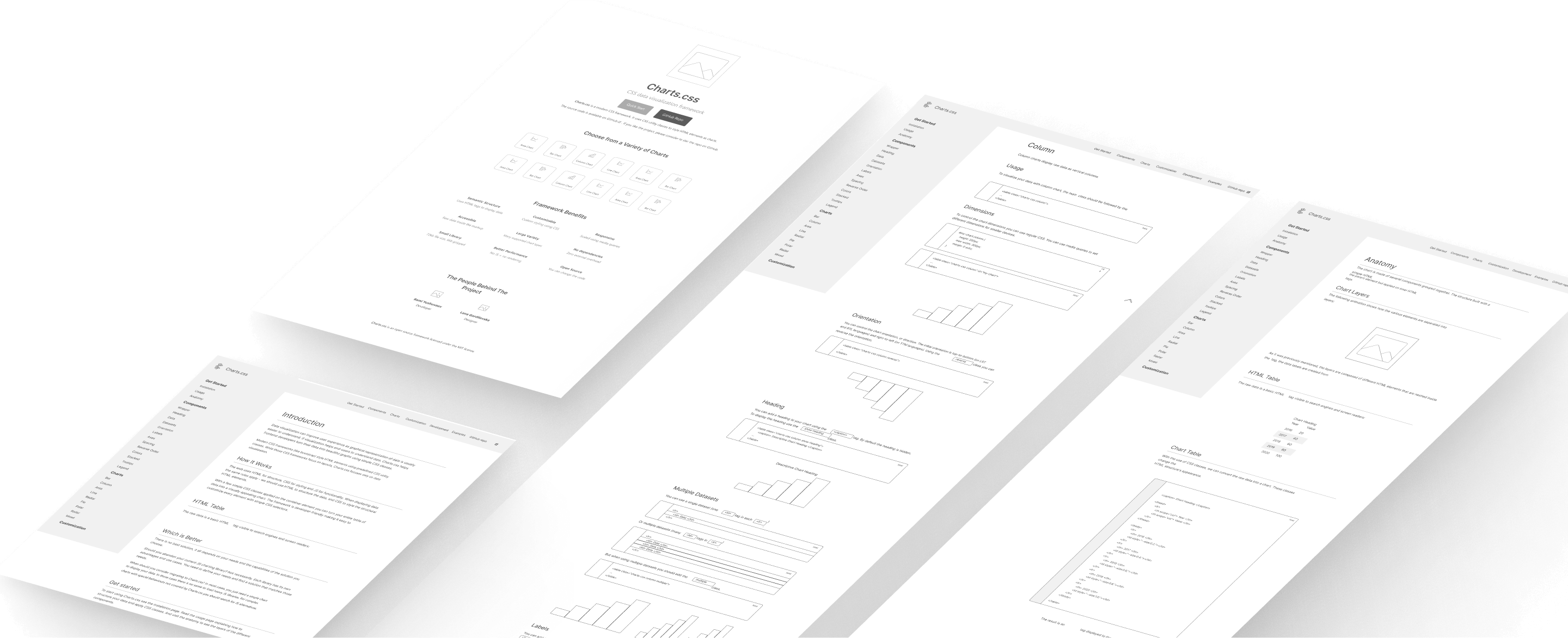
Wireframes
Typography & colors
Typography

Color palette

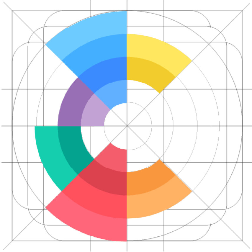
Logo structure
The challenge was not to create a simple logo through visualization of the chart, but to leave a memorable impression. It was achieved using animation that implements different speed effects for different elements
Visual design
The homepage layout was changed to provide more value for first time users.
The logo was designed to be memorable and distinct, catering to user recognition.
The homepage content was updated, instead of focusing on the fact that it’s an open-source framework, the focus was on what the framework does and its capabilities.
Project outcome
All the changes resulted in increased homepage conversion rate with direct traffic to specific chart types, increased page-views per-user, and a decrease of abandonment rate.
The framework got nice feedbacks from users that appreciated the platform value, and stand out from other platforms because of its outstanding logo.
